Profit margin per manufacturer as a chart
Here we would like to show you that you can use cobby and Excel not only for product maintenance, but also for dynamic evaluations using the pivot table.
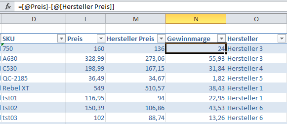
To demonstrate the use of the pivot table, we will show how to create a chart that shows the profit margin per manufacturer. We start by determining the profit margin: to do this, we create a new column in the AllProducts table and name it ProfitMargin. We determine the margin by subtracting the Purchase Price (Manufacturer Price column) from the Sale Price (Price column).
We insert the formula =[@price]-[@[manufacturer price]] into the new column and apply the formula to all rows of this column.
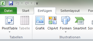
Now we have prepared the table and can start with the pivot table. Important: The currently selected cell must be inside the AllProducts sheet. To create a pivot table, we switch to the Insert tab in the ribbon and click on PivotTable.
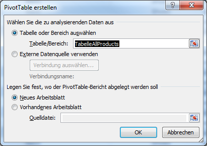
After that the Create PivotTable dialog opens. Since we have selected a cell from the AllProducts sheet, Excel automatically sets the correct range (TableAllProducts). Now only confirm with OK.
After confirming the dialog, Excel changes to a new sheet with an empty pivot table.
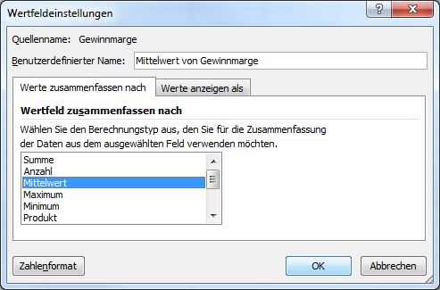
On the right side there is a list with all available fields. Below the field list there are four areas where the fields can be dragged with the mouse. Depending on where we place the fields, the pivot table changes. For our task we need the fields "Profit margin" and "Manufacturer". To do this, we drag the Profit Margin field into the Value area and Manufacturer into the Cell Labels area. For the fields in the Value area, Number is selected as the calculation type by default, but we need the average value. To get the average value, we click on the "Profit Margin" field in the Value area. A menu opens and there we select Value field settings....
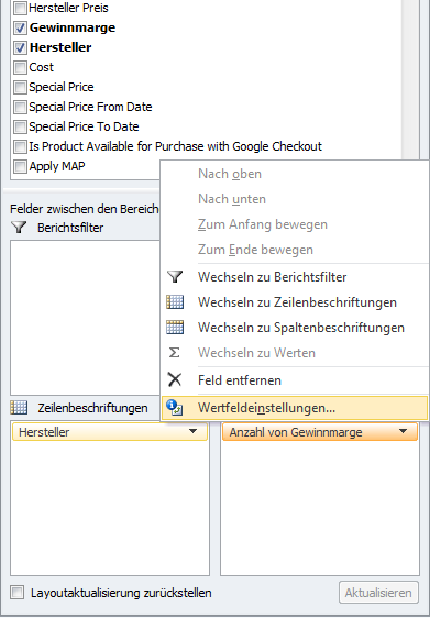
In the Value field settings dialog we select Average and confirm with "OK".
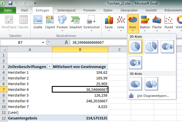
Now the pivot table already looks quite good: It is grouped by manufacturer with the respective mean value of the profit margin. However, it would be even nicer if we prepared the values graphically. To do this, we select a cell in our pivot table and switch to the Insert ribbon. There we click on the desired chart type, here a 2D circle.
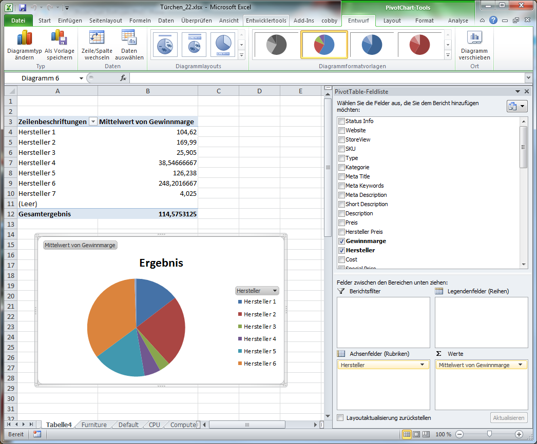
Excel automatically generates the chart based on the table values. If you want, you can now customize the chart design.
The pivot table is a very extensive topic and cannot be explained in every detail here. For all those who want to deal with the topic more intensively, there are many instructions and explanations on the Internet.