How to Create Profit Margin Charts by Manufacturer
Learn how to use Excel's pivot tables to analyze profit margins by manufacturer and create visual charts. This guide demonstrates how cobby and Excel can be used not just for product maintenance, but also for dynamic business intelligence.
Goal
Create a visual chart showing average profit margin per manufacturer to identify which suppliers provide the best margins.
Prerequisites
- Product data loaded in cobby with:
- Price (sale price)
- Manufacturer Price (purchase price)
- Manufacturer (vendor name)
- Basic understanding of Excel
Steps
Step 1: Calculate Profit Margin
First, create a calculated column to determine profit margin for each product.
- In the AllProducts table, create a new column named ProfitMargin
- Enter the formula:
=[@Price]-[@[Manufacturer Price]] - Apply the formula to all rows in the column
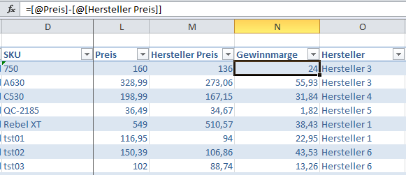
What this does: Subtracts the purchase price (Manufacturer Price) from the sale price (Price) to calculate the profit margin per product.
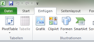
Step 2: Create a Pivot Table
- Select a cell inside the AllProducts table
- Go to the Insert tab in the ribbon
- Click PivotTable
Step 3: Configure the Pivot Table Dialog
The Create PivotTable dialog opens:
- Excel automatically sets the correct range (TableAllProducts)
- Click OK to confirm
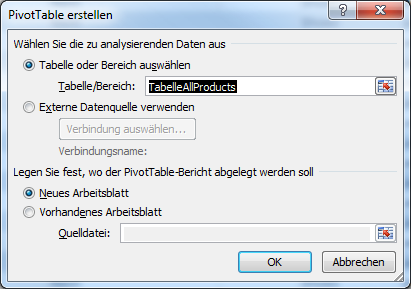
Excel creates a new sheet with an empty pivot table.
Step 4: Add Fields to the Pivot Table
On the right side, you'll see a list of available fields and four areas where fields can be dragged:
- Drag Profit Margin to the Values area
- Drag Manufacturer to the Row Labels area
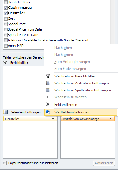
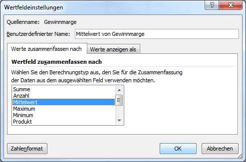
Step 5: Change Calculation to Average
By default, the Values area uses "Sum" as the calculation type, but we need the average value:
- Click on the Profit Margin field in the Values area
- A menu opens - select Value field settings...
- In the dialog, select Average
- Click OK to confirm
Your pivot table now shows manufacturers grouped with their respective average profit margin.
Step 6: Create a Chart from the Pivot Table
Now visualize the data with a chart:
- Select a cell in your pivot table
- Go to the Insert ribbon
- Click on your desired chart type (e.g., 2D Pie Chart)
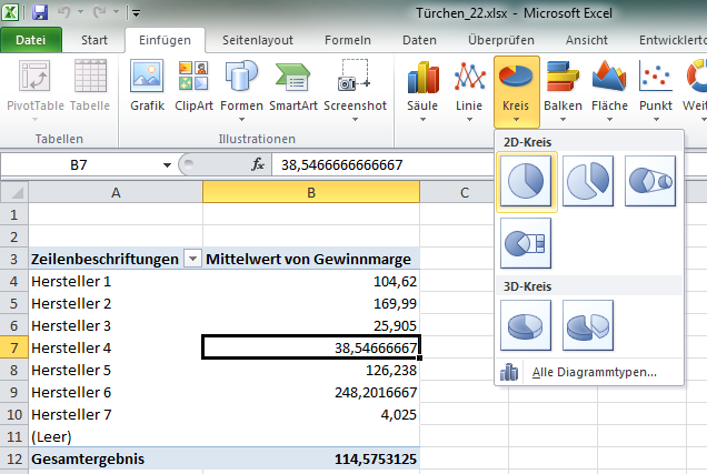
Excel automatically generates the chart based on the pivot table values.
Step 7: Customize the Chart (Optional)
Customize the chart design to match your preferences:
- Change colors
- Add data labels
- Modify chart title
- Adjust legend position
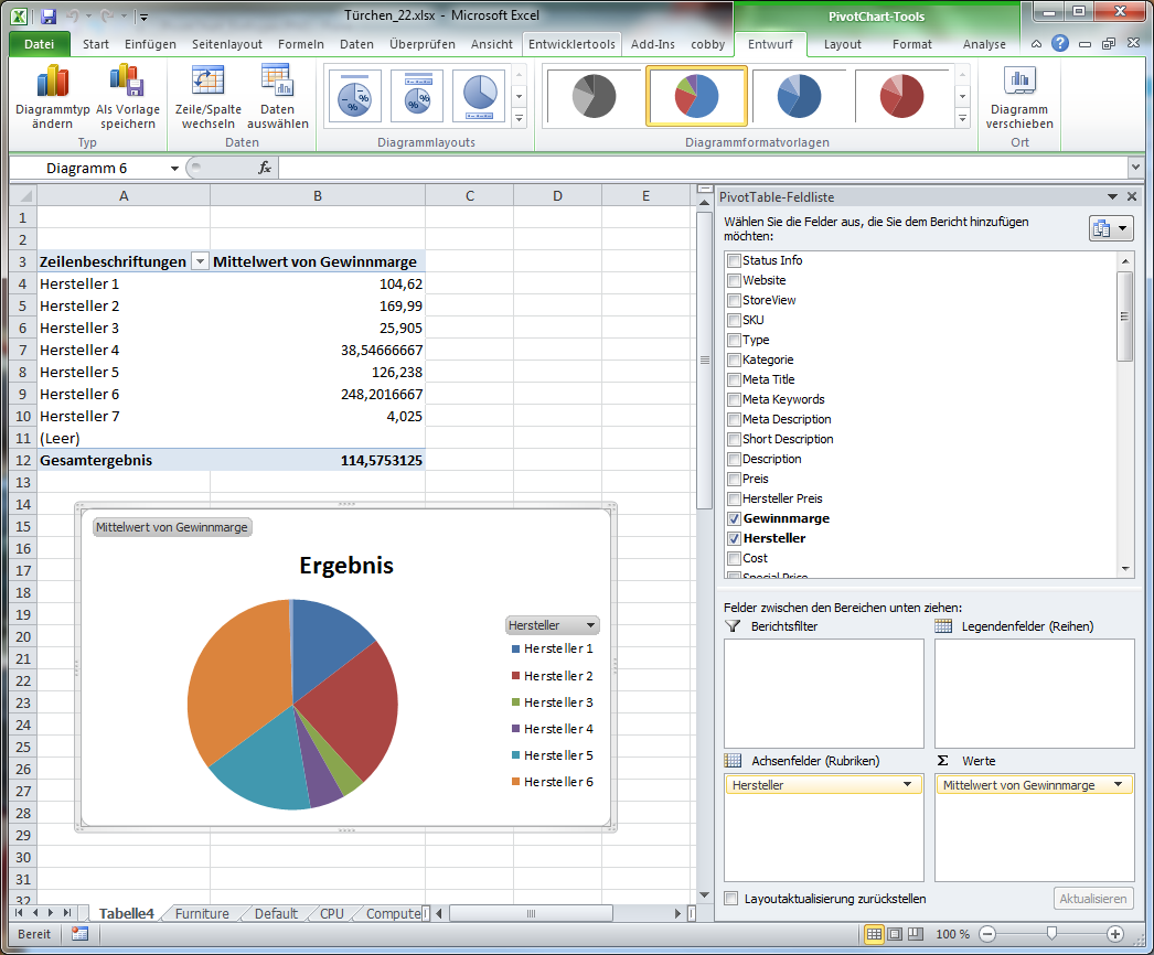
Chart Type Recommendations
Depending on your data and goals, consider these chart types:
- Pie Chart: Best for showing proportion of total (works well for 4-7 manufacturers)
- Bar Chart: Best for comparing many manufacturers or showing exact values
- Column Chart: Good for highlighting differences between manufacturers
- Line Chart: Best if tracking changes over time (requires multiple data points)
Example Results
Your chart might reveal insights like:
- Manufacturer A provides 35% higher margins than competitors
- Manufacturer C has the lowest margins at 15%
- Your top 3 manufacturers account for 80% of your total profit margin
Advanced Analysis Tips
Segment by Category
Add Category to the Columns area to see profit margins by manufacturer and category.
Filter by Product Type
Use the Filter area to analyze specific product types or price ranges.
Add Product Count
Drag SKU to the Values area (set to Count) to see how many products each manufacturer provides.
Calculate Margin Percentage
Add another calculated column: =[@ProfitMargin]/[@Price]*100 to show margin as a percentage.
Troubleshooting
Pivot table not creating
Make sure you selected a cell inside the AllProducts table before clicking PivotTable.
Wrong calculation showing
Check that you changed the Value field settings to "Average" instead of "Sum".
Chart looks cluttered
If you have many manufacturers, consider using a bar chart instead of a pie chart.
Negative margins showing
Verify that your Price and Manufacturer Price columns contain correct data. Negative margins indicate products selling below cost.
Data not updating
Refresh the pivot table (right-click → Refresh) after changing source data.
Next Steps
- Create similar analyses for other metrics (inventory turnover, category performance)
- Combine multiple charts in a dashboard
- Export charts to presentations or reports
- Set up regular reporting schedules
- Share insights with your team
Additional Resources
Pivot tables are a powerful Excel feature with many more capabilities. For deeper understanding, search for "Excel pivot table tutorials" online for comprehensive guides and video tutorials.